QUANTGENE

Client

Quantgene

About the Company

Quantgene is an innovative startup looking to take the medical space to a new level with deep genomics technology and AI learning.

SITE CASE STUDY

THE CHALLENGE

Create a refresh of the brand style guide for Quantgene that showcases human innovation in deep genomic technology.

WHY THE NEED FOR A REFRESH?

As Quantgene expands, the brand needed a style narrative that can grow and evolve with the updated content.


The previous brand narrative was styled in a way that kept the visual narrative in an unrefined stage. This change was needed in order to create a cleaner branding to keep up with competitors.


Implementing a re-organized sitemap was essential for the platform users to comprehend the complex technology

FOUNDATIONS OF
THE PROJECT

ROLE

Art Director

Brand Designer

Designer

TOOLS USED

Figma

Photoshop

Illustrator

InDesign

Google Slides

PowerPoint

Visual Narrative

Emphasis on machine learning products

TARGET AUDIENCE

Medical Partners

(Current Clientele & Prospects)

Tech-savvy viewers

MESSAGE OF THE COMPANY

Advanced technology that powers Quantgene’s commercial and MD facing products

DESIGN RESEARCH & COMPETITOR ANALYSIS

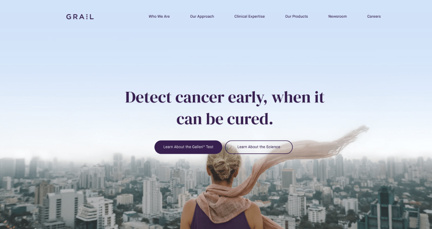
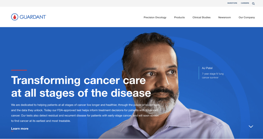
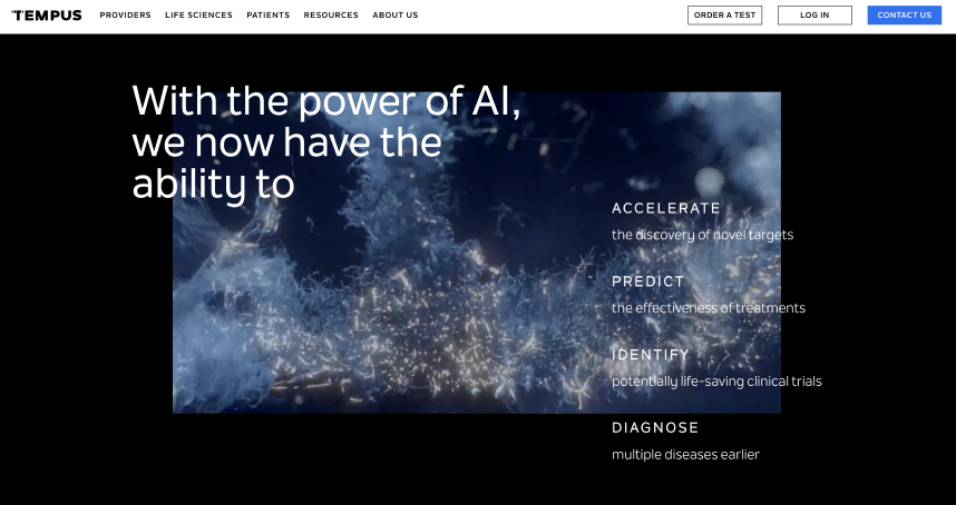
notable competitors

Tempus

Guardiant Health

Grail

Focusing on one product, the competition illustrates their company mission and goals with  clarity. These organizations capitalize on the simplicity of their products with the use of familiar images and messaging. This leads to the retention of their users as well as attracting future users.


The challenge Quantgene faces are the various products they provide. With four revolutionary products, the question presents itself; “What is Quantgene’s role in the Biotech industry?


Answer: Quantgene holds the technology that successfully powers all of their products

SITE MAPPING

Restructuring the given content was essential, prior to creating the wireframes. Successfully implementing CTAs on the page, as well as having them linked to additional information on Quantgene’s technology and products, I assisted the internal teams with organization.

WIREFRAMES

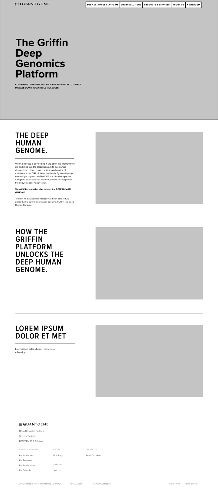
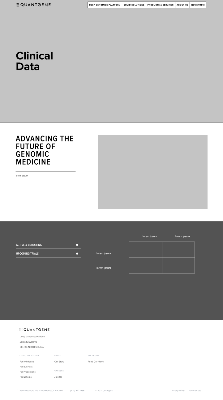
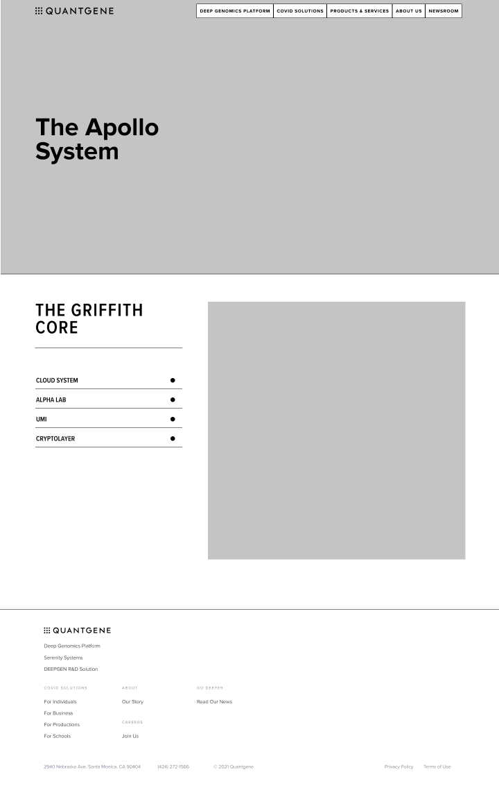
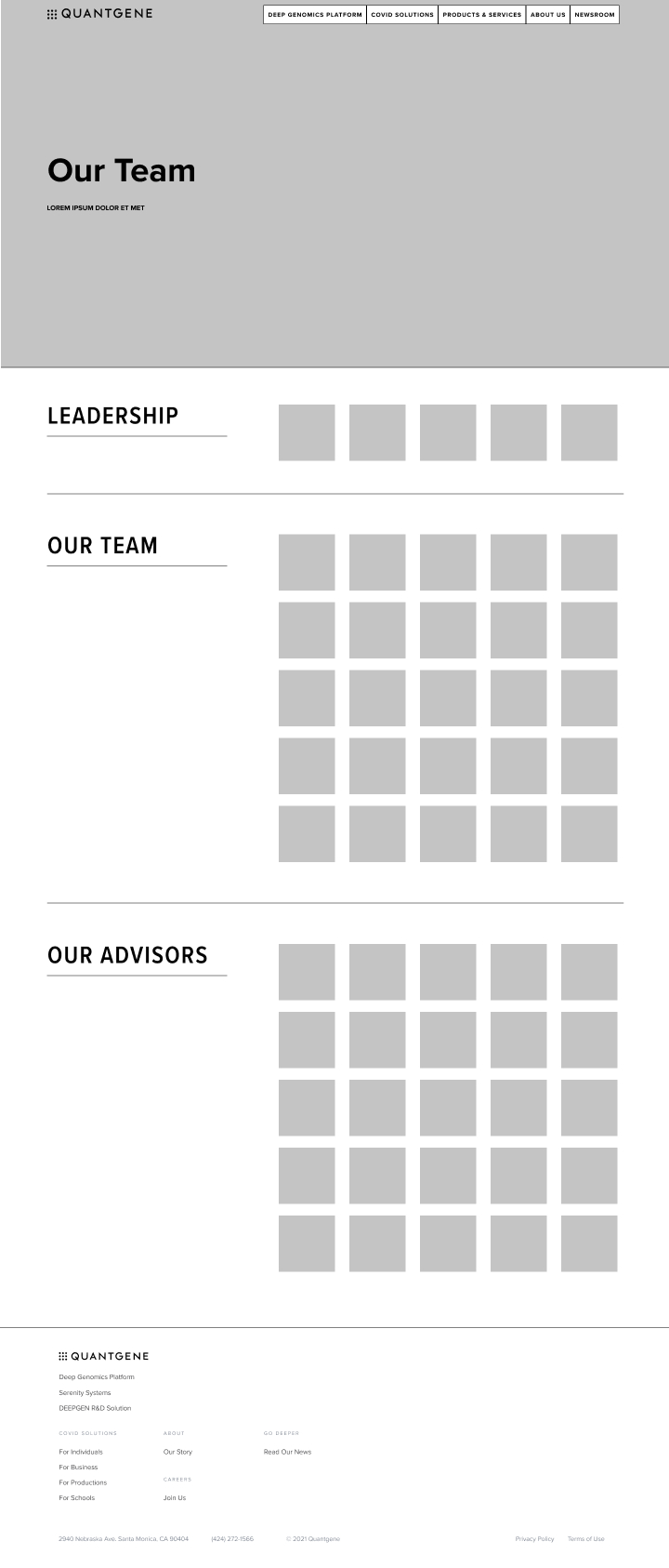
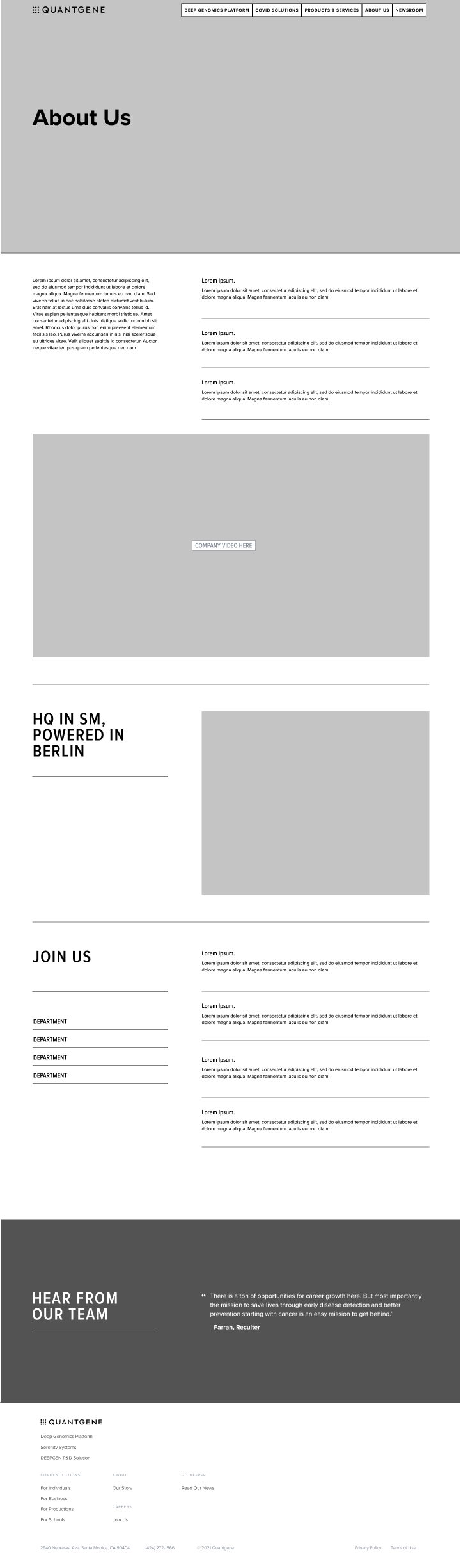
With the initial site map in mind, I displayed a first draft of the wireframe copy on a mobile device, tablet and personal computer. This allowed the messaging to be visible with ease for all users.

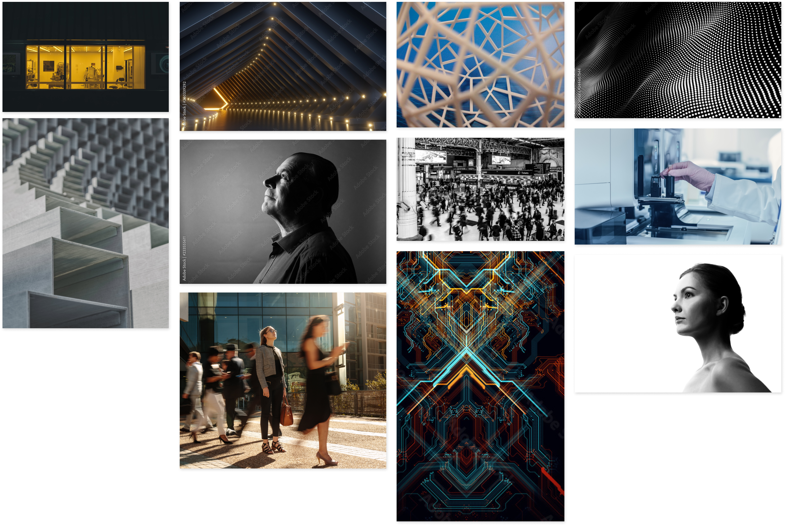
MOODBOARDS

By spearheading the moodboards for the brand entirely, this allowed me to clearly express the messaging for Quantgene. This step created a feel for the type of imagery the company wanted to portray, whether it was more in tune with consumers’ current setting or allude to abstract, futuristic patterns.

MORE DESIGN ITERATIONS

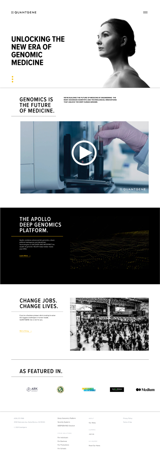
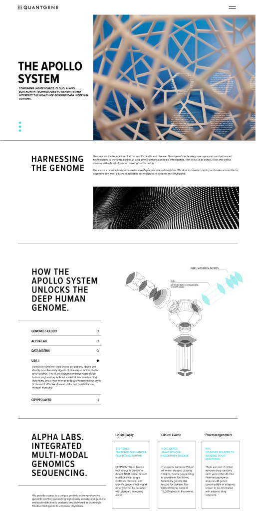
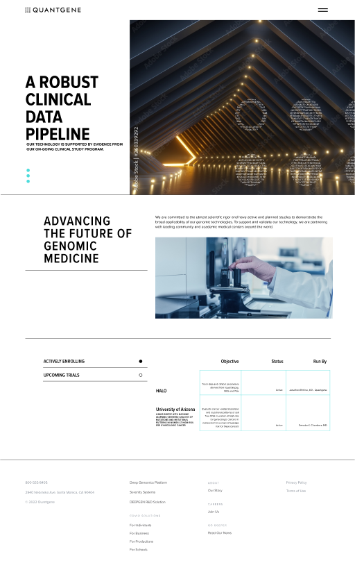
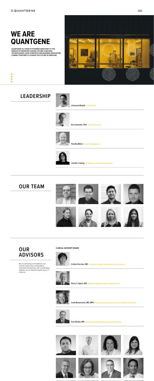
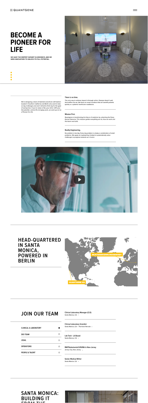
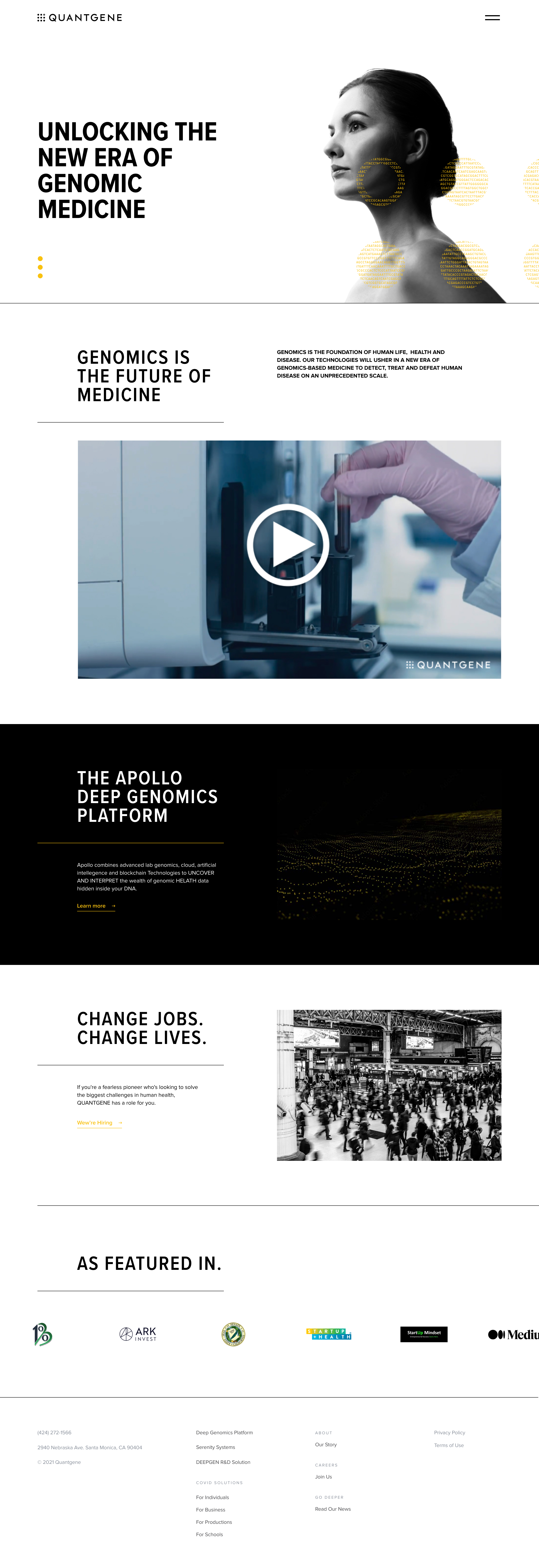
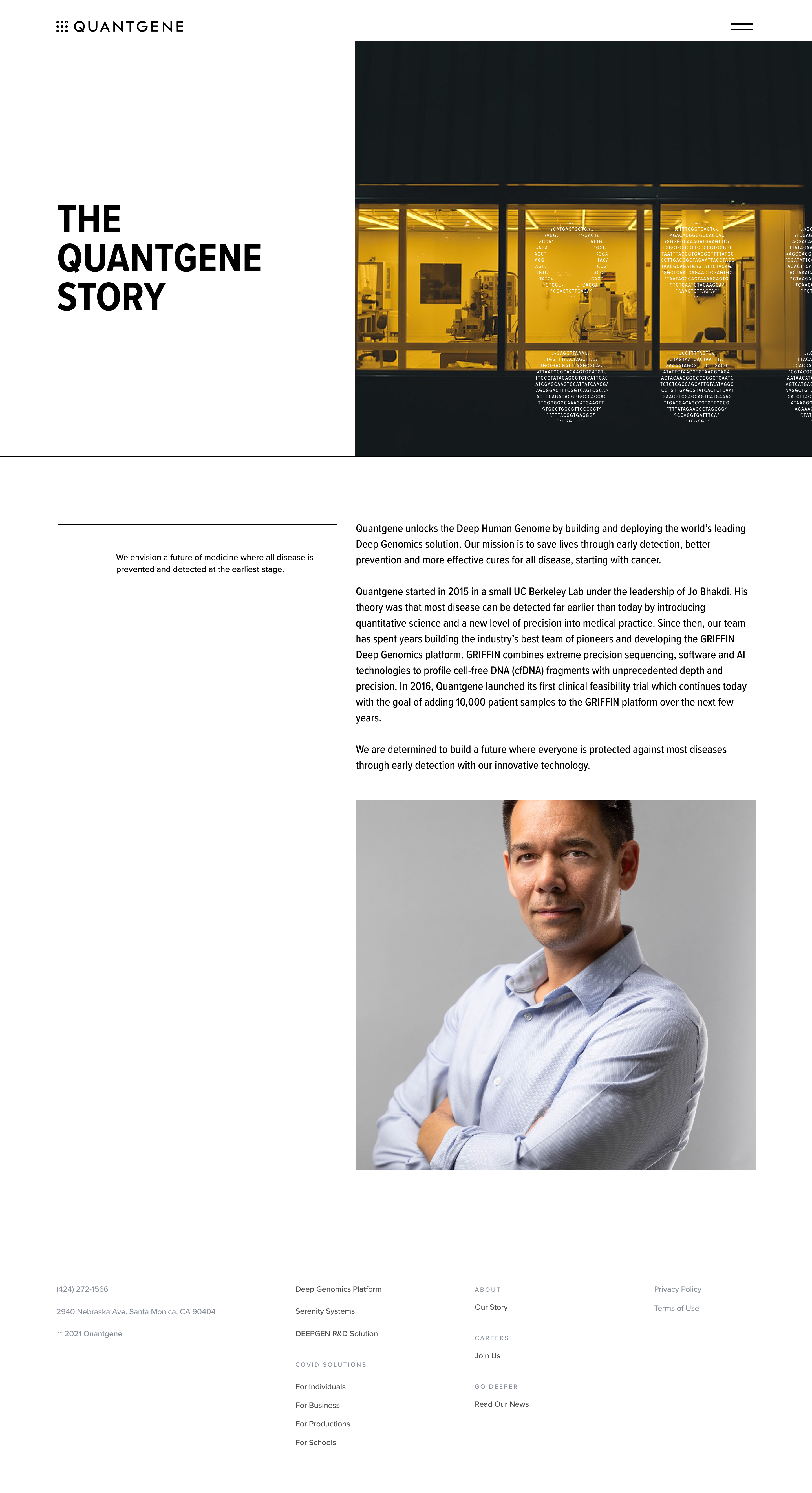
As the project progressed and the branding almost finalized, I was able to create high fidelity wireframes to present to the rest of the team and Quantgene’s clientele.

STYLEGUIDE

After feedback on the wireframes and initial positioning of the branding was given, the style guide was fully built out. The use of multiple colors, though unorthodox, was to serve as the main color of Quantgene, and so, is shown on pages that primarily talk about GQ as a company. The blue is used when the information on the page refers to the company’s technology. The green serves as the style color for PanProtect.

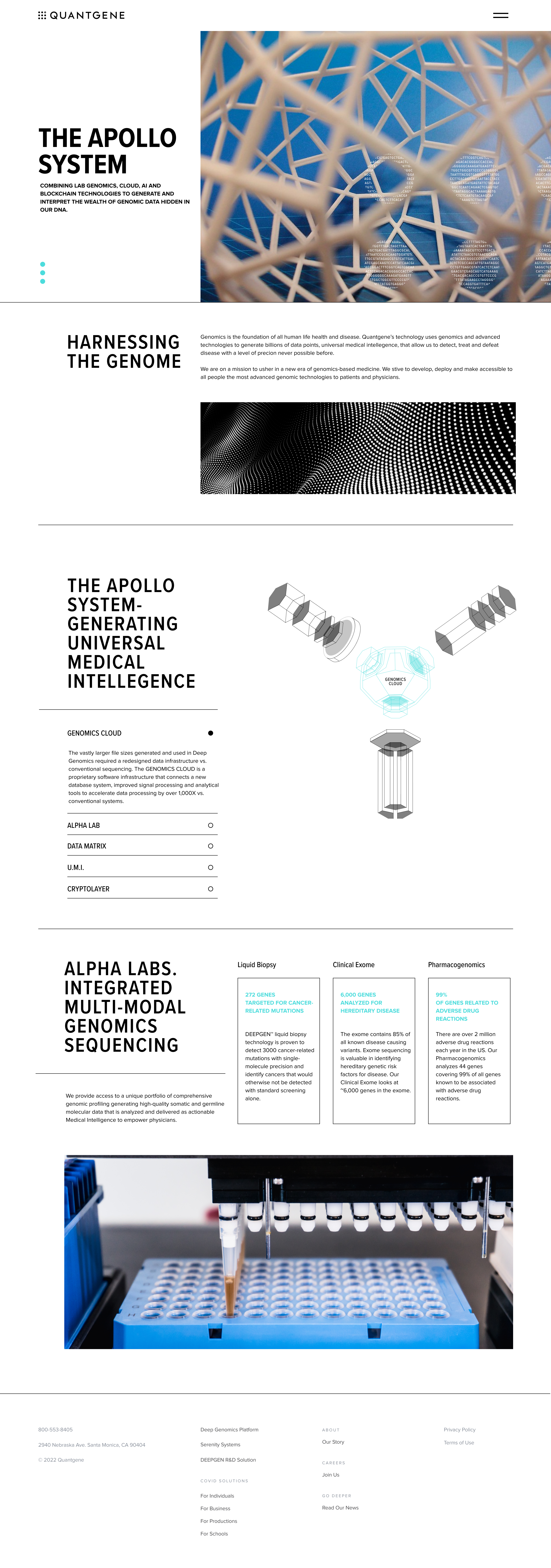
FINALIZED SITE

As the project progressed and and the branding concluding, I successfully created high fidelity wireframes to present to the internal team and the clientele before passing onto the developers.

OTHER BRANDED ASSETS

GOOGLE SLIDES / POWERPOINT TEMPLATE

TEAM

Jennifer Freiling – Project Lead
Zach Glass – Head of Growth Marketing

Grace Erickson – Marketing Manager
Stephanie Song – Project Manager
Tin Bayle – Art Director / Designer

Next Project