SERENITY

Client

Quantgene

About the Product

Serenity is a new system of concierge medicine that offers different tests to patients as opposed to traditional healthcare. This includes liquid biopsy and pharmacogenomics.

project summary

The team was tasked with several challenges on marketing, product and operation fronts. The most urgent task was the website design and packaging for the four blood and genetic tests. The website was to serve as an information hub to consumers while Quantgene would move on to developing a portal utilized by members as they are integrated into the pipeline. The use of digital ads and social media awareness were needed to publicize Serenity as well as attract early consumers for the MVP Launch.

FOUNDATIONS OF THE PROJECT

ROLE

Art Director
UX/UI Designer
Senior Graphic Designer

TOOLS USED

Photoshop
Figma
InDesign
AfterEffects
Premiere Pro
Illustrator
Google Suite

TARGET AUDIENCE

At-risk patients

(roughly ages 40-70)


Health conscious individuals
(roughly ages 25-45)

THE CHALLENGE

Establishing a ‘brand or style’ that will be applied through a member portal to be marketed towards consumers via website, digital ads, social media and in-person meetings.

SITE CASE STUDY

DESIGN RESEARCH & COMPETITOR ANALYSIS

NOTABLE COMPETITORS:

Gallant
Hims
Seed

We researched several competitors as well as cosmetic markets we felt were relevant to the messaging we wanted to portray for the website.

MOODBOARDS

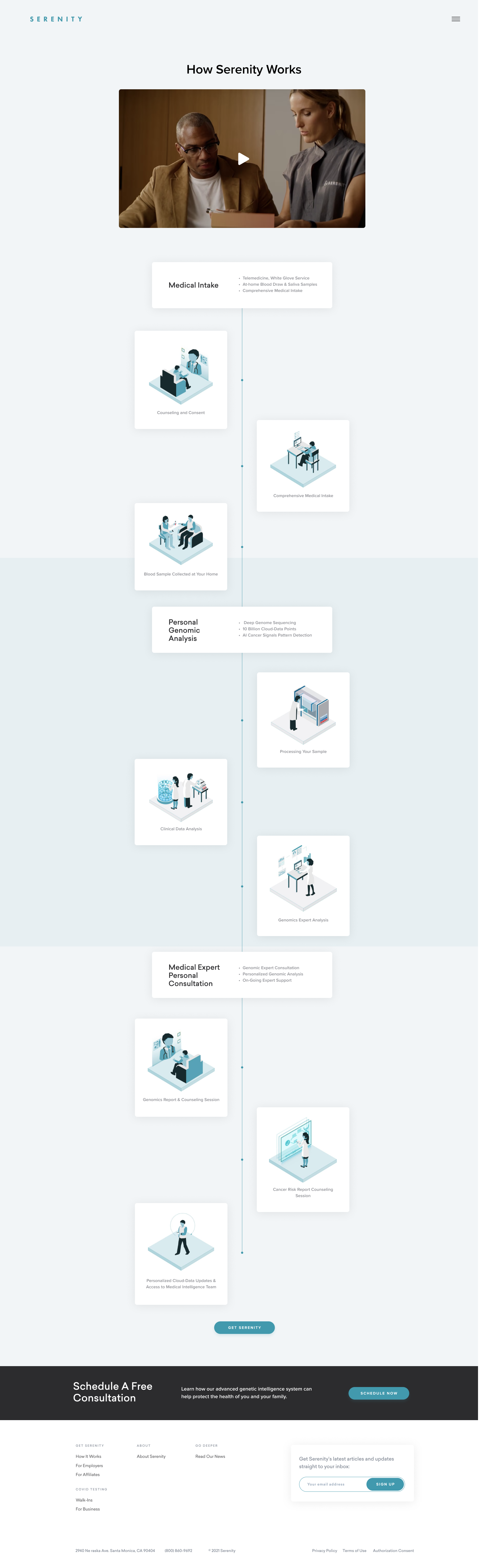
There were two options to portray the branding: “You” – centric and “Product” centric. Moving forward with the “You” – centric branding, it showcased a more intimate connection to the lifestyle and product rather than basing the message solely to showcase the breakdown of the product.


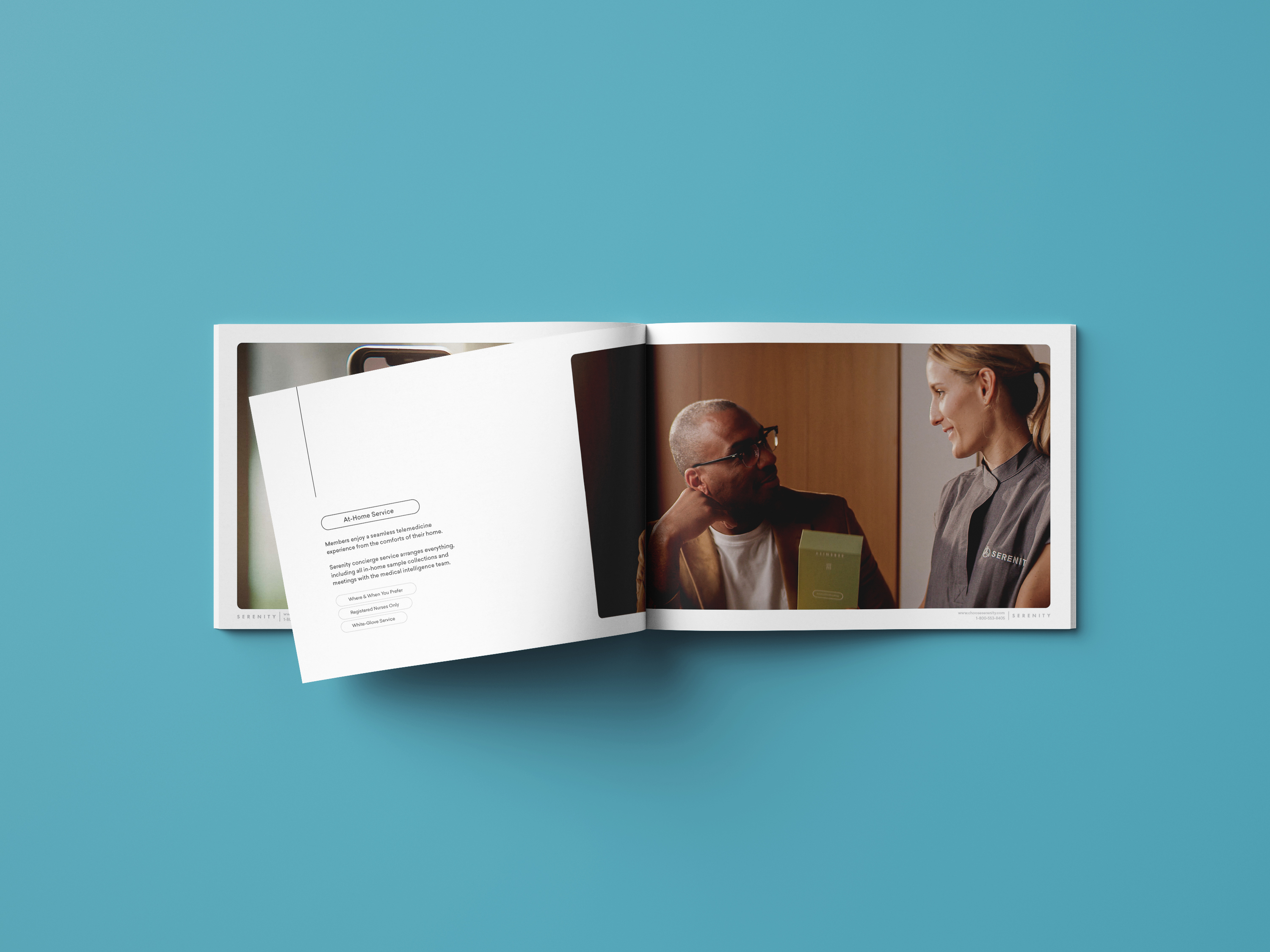
The question was then asked: “How are we choosing to educate the people on their health? I need to make this conversation, often a private conversation, relatable. Shifting the branding to focus on the people, this allowed us to emphasize their lives and health through comforting and interpersonal imagery.

WIREFRAMES

While creating the wireframes, we ran into an issue with showcasing the different types of testing offered. As mentioned earlier, how do we explain the tests without taking away from the “You”-centric visual narrative? I developed an on-scroll carousel that placed the individual’s image at the center as well as the testing data surrounding the image, visualizing the “protective healthcare layer.

DESIGN ITERATIONS

With copy almost fully netted out and initial rounds of imagery found, more high-fidelity wireframes were produced. The team created our own assets instead of relying on found stock images after reviewing the feedback on the designs. From video files that were developed, I was able to pull visuals that would live on the site and other promotional assets.

COLOR & TYPOGRAPHY

FINALIZED SITE

As the project progressed and the branding almost finalized, I was able to produce high fidelity wireframes to present to the client and the team before sharing it to the developers.

PORTAL CASE STUDY

DESIGN RESEARCH & COMPETITOR ANALYSIS

NOTABLE COMPETITORS:

Kaiser Permanente
23&Me
Invitae
Humanity
Smile Direct
One Medical

Our team studied several app competitors for this project. Due to the scope of the project, we began it through highly collaborative workshops with marketing, operations and product teams. The goal was to make a fully encompassed membership portal that guides the patient from medical intake to in-person testing to follow-up appointments.

USER MAPPING

Since the user flow of the product does not begin with signing into the portal, we started the project by creating the different user-personals.


Each user would get funneled into the app in different ways:

Serenity VIPs

Early Adopters

New Clientele

Previous COVID customers that already existed in Quantgene’s database

From these personas, we were able to pinpoint where their integration into the pipeline would be. Whether it be through marketing ads, in-person sales meetings or COVID portal users who would want to upgrade their plan to Serenity.

WIREFRAMING

From these personas, we were able to pinpoint where their integration into the pipeline would be. Whether it be through marketing ads, in-person sales meetings or COVID portal users who would want to upgrade their plan to Serenity.

DESIGNS ON
DESIGNS ON
DESIGNS ON
DESIGNS

Design iterations were netted out for both the mobile app and the desktop portal. As the project grew, the marketing strategy also changed. I worked closely with the engineers as well as the project manager to meet the clinical teams’ needs on the consumer side. This included the reworking of the clinical intake. Much of the intake needed to be condensed into a simple and yet detailed questionnaire for the patients and physicians. The full intake strategy was then immigrated into another product: 20Q.

FINALIZATION & CONCLUSION

Because the marketing strategy around the medical intake transformed into 20Q, the Serenity Membership Portal designs were largely based on 20Q’s dashboard. The final design played on the similar UX functions of 20Q, but additional features were included based on the research and design flows created. The end product still utilized the design systems previously established with a more transparent UI familiar to 20Q users.

ADS & SOCIAL

LINKEDIN ADS

TARGET AUDIENCE

Disney Executives

LINKEDIN ADS

TARGET AUDIENCE

General Executives

NEW YEAR SOCIAL ADS

TARGET AUDIENCE

Ages 25-40

Post

Story

Post

Story

Post

Story

TARGET AUDIENCE

Ages 40-70

Post

Story

Post

Story

SOCIAL FEED TEMPLATE

I created a template with a pattern that comes together when the entire feed is viewed and works as a graphic overlay when each post appears on the social feed.

Full feed can be found on the company’s Instagram.

BOOKLET

SERENITY BRAND BOOKLET

In parallel to the website, I was also tasked with designing the booklet that would be used in sales pitches. This design keeps the same motif found throughout the branding as can be seen in the colors, graphics, and overall look and feel.

TEAM

Tin Bayle – Designer / Art Director

Jennifer Freiling – VP of Marketing
Jordan Satta – Creative Director
Brian Frost – Creative Director, Copy
Grace Erickson – Marketing Manager

Ji Kim – Operations Manager
Carlo Anacta – Designer

Next Project